Composition: How it Affects Our Interpretation of Design and Space
“The hard part is how to plan a picture so as to give to others what has happened to you. To render in paint an experience, to suggest the sense of light and color, of air and space.”
Photo by Aaron Huber on Unsplash
Today we have our phones, and their cameras ready, for any memory to be recorded and added to our virtual arsenal in an instant. If you’re anything like me just walking down the street and seeing something I deem beautiful turns me into an aspiring photographer (I actually walked into a street sign in NYC once while admiring the architecture), but the truth is no level of equipment, space, or lighting has as much of an effect on an image as its composition. This also applies to renderings and other forms of art, architecture, and interior design. I remember a professor in college spent an entire semester drilling the importance of composition and decisive design, in architecture, into our heads. Our little block models would be torn apart (both figuratively and physically) if there wasn’t a true purpose for why and how it was laid out. He said that unless you have an undeniable reason and justification for why a design element was there, then its not necessary. Maybe this is a trickle down institutionalized view from the Bauhaus days (I told you I was an archi-nerd), but this belief has made more of an impact on my designs and renderings than most anything else from my five years of college.
Simplicity with intent is evident in history’s greatest works of art, there are scholars who spend their careers deciphering the use of colors, composition, and textures, because they were so purposefully added and symbolic (ie. Mona Lisa, The Last Supper, the Starry Night, etc.) they are what makes them unique. This same level of insistence in design can also be found in interiors and architecture. The fabric a designer selects may be a direct reflection of a millwork detail designed by the architect who was inspired by the landscape. These factors are tirelessly thought through and coordinated over a series of months, or years for that matter. With that in mind its easy to understand the magnitude that well composed renderings and photography can have during, and after, the completion of a project. While photography captures the final design, which has already been sold, approved, and now being enjoyed by the designer’s clients; the renderings are the first glimpse of what the space will truly feel like and selling the scheme to not only the owners, but the public and editorial entities.
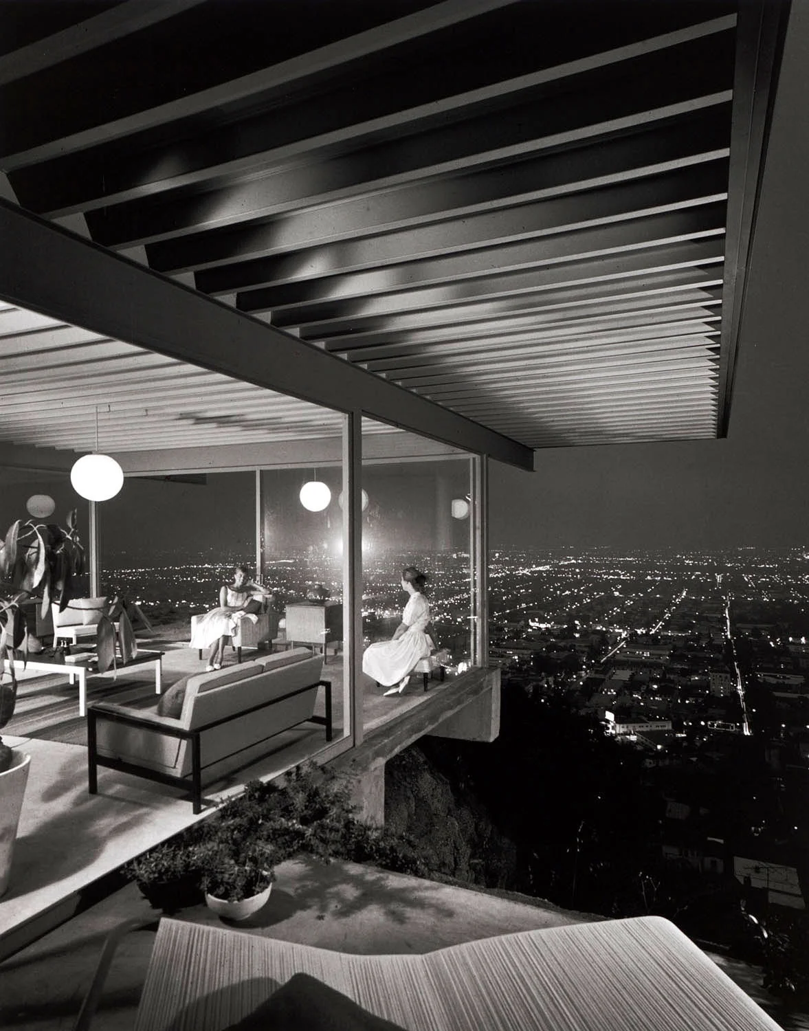
A well composed rendering should be similar to a shot through a camera lens. For those who layout these views, take into account the placement, symmetry, height and span of the shot. Julius Shulman, the architectural photographer who changed how we view architecture, once said,
““Architects live and die by the images taken of their work; as these images alone are what people see. For every one person who visits a private house, there may be ten thousand who only view it as a photo.””
If you haven’t had the chance to watch ‘Visual Acoustics: The Modernism of Julius Shulman’ its a must for any architect, interior designer, photographer, and rendering artist. Shulman’s central view to photography is patience and willingness to concentrate on a well composed shot, but what, other than the natural intuition of an artist like Shulman, are good guides to a well proportioned perspective?
A key to remember is, don't be afraid of movement. What can be captured in photography and renderings are not necessarily the everyday view or how the space is lived in, unless that is the desired aesthetic. The image below is a pretty good 'beginner' guide for visualizing 'distribution of space'. Its a really good key. Take a look at the diagram and compare it to the photography and renderings in this post, can you see the position options shown (look at row 2).
Another very good way for seeing a well laid out composition is, is it still appealing if its cropped apart and almost abstract? Is there a variation of directions and colors or tones?
“Architecture should speak of its time and place, but yearn for timelessness.”
JULIUS SHULMAN- Afternoon shadows, Del Marcos Hotel, Palm Springs, by architect William F. Cody, ca. 1950-1959 (image and caption via artnet.com)
JULIUS SHULMAN - Case Study House #22, Two Girls, 1960
Temple of the Seven Golden Camels_ 10 Minute Art School_ Composition 101
“There is a proper measure in all things, certain limits beyond which and short of which right is not to be found. Who so cultivated the golden mean avoids the poverty of a hovel and the envy of a palace.”
California Office | Designed by Antoinette Designs| Rendered by Kelly Fridline Design using Chief Architect X10
Basement Rendering | Designed by Stalburg Design| Rendered by Kelly Fridline Design using Chief Architect X10
Elegant Entryway | Designed by Karen Grant Interiors| Rendered by Kelly Fridline Design using Chief Architect X10
Sola Salons Entryway Scheme | Designed by Bell + Boy Design Co.| Rendered by Kelly Fridline Design using Chief Architect X10


